
What should you wear to AWP20 in San Antonio this year?
For those who do not know, AWP is the Association of Writers & Writing Programs, and their annual conference is coming up:
#AWP20 Conference and Bookfair
San Antonio, TX
Henry B. González Convention Center
March 4–7, 2020
Key Dates
- February 26, 2020: Deadline to submit Offsite Events
- February 26, 2020: Deadline to request changes to digital event schedules
- March 4, 2020: Onsite registration opens
Materials to View/Download
- Attendee Guide
- Conference & Bookfair App
- San Antonio Community Resources
- AWP’s Guide to Accessible Literary Events
Social Networking
- Twitter: use #AWP20
- Bookfair Facebook Page
- Instagram: use #AWP20
[I wrote the following observations following #AWP17 in Tampa, though it feels like I started writing them at #AWP16 in Washington DC. I hope my attempt at sarcasm offends everyone equally, but no one gravely!-KD]
I’ve just attended the 2017 Association of Writing Programs (AWP) conference with some 13,000 students and faculty from writing programs and universities around the United States in attendance. I sat among representatives of small presses in the cavernous hall that housed the book market. Everyone was trying to attract students to their writing programs, authors to their submission pages, and buyers to their books. Meanwhile, a profusion of recent MFA and PhD grads schmoozed and congratulated one another comparing notes about the dismal state of the academic job market and reminiscing about grad school. Many had job interviews in hotel rooms scheduled around the trendy off-site readings and parties, though with the advent of the Skype interview, the formerly nerve-wracking AWP interview is not now the right of passage it once was. Still, the young guns found their old friends and discussed who had landed increasingly rare tenure-track jobs and who was still on the market and spending hard-earned adjunct wages to be there. They compared the climates of their respective universities—politically and meteorologically. They drank too much and slept too little, while seasoned faculty members chaperoned grad students—the target consumer group for the massive book fair and the audience for the panel discussions and readings in and around the conference.
I sat behind a crenellated battlement of books I couldn’t even give away and watched people stream past for all three days of the conference. White male Boomer-aged professors wore sports coats and jeans, grey pony tails and earrings the fashion accessories of choice. The African American tenured men favored bright silks and glistening shaved heads. All wore “cool” more comfortably than their female counterparts, who, apart from the tastefully professional African American women, appeared to be either crones or mutton-dressed-as-lamb. Since I fall on that spectrum myself, I feel qualified to comment. The crones gossiped a little too loudly, hair in awkward tufts, mascara smudged, while the mutton-dressed-as-lamb draped chic, risqué clothing over skeletal frames a little too casually, their entourage of graduate assistants shielding them from direct light.
The newly tenured wore uniforms of respectability, tattoos covered. Button-down shirts and sweater vests for the men and blouses over cigarette-skirts for the women with stockings and sensible pumps. The millenials dressed in predictable gender-blended variations, hairstyles their most obvious concession to fashion. Extravagant undercuts and outlandish color declaring their lifestyle choices. Students showed facial-jewelry, body art, and outlandish clothes, while professors favored short buzz-cuts.
And there were poets everywhere. At off-site readings, I listened to angst-ridden verses about sex—childhood abuse, and low self-esteem. Young poets marveled that anyone would have them and ended in despair. Old poets read about their mortality, exploring the seasons through metaphor inevitably resigning themselves to the inevitable. Veterans read in the staccato rhythm of gunfire ending abruptly. Despite the repetitive themes, the abundance of creative writing programs has brought about a renaissance in poetry, but knowing how difficult it is to sell poetry, I expressed my dismay at this situation to Michael Gills—a seasoned fiction writer and professor in jeans and cowboy boots. He set me straight explaining that, in his view, all these programs obviously turned out far more writers than we need, but each of those new writers is also a voracious reader. It’s a kind of writerly-readerly circle jerk.
At the end of the day, when selecting what to pack for AWP20 in San Antonio March 4-8, remember who the audience will be. And remember what you are there for. If you want to sell books, dress like someone who belongs on a university campus. “Business casual” is always safe, but if something more casual is appropriate for your audience, then wear that. Be yourself.
What will the weather be like?
We can guarantee that the weather in San Antonio, Texas, is warmer than where you come from. But it will be early march. You shouldn’t need more than one of the following: a light jacket, blazer, hoodie, or cardigan. Bring light weight clothes you can layer. We predict that we’ll all start shedding layers by lunchtime.
Generally in March, San Antonio maintains an average daily high temperature between 71 and 76 degrees Fahrenheit (21 to 25 degrees Celsius), while the average low temperature ranges between 48 and 54 °F (9 to 12 °C). 56% average humidity. San Antonio tends to get about nine days of rain most years during the month of March. Be sure to have a look at the forcast a few days ahead of your departure for San Antonio.
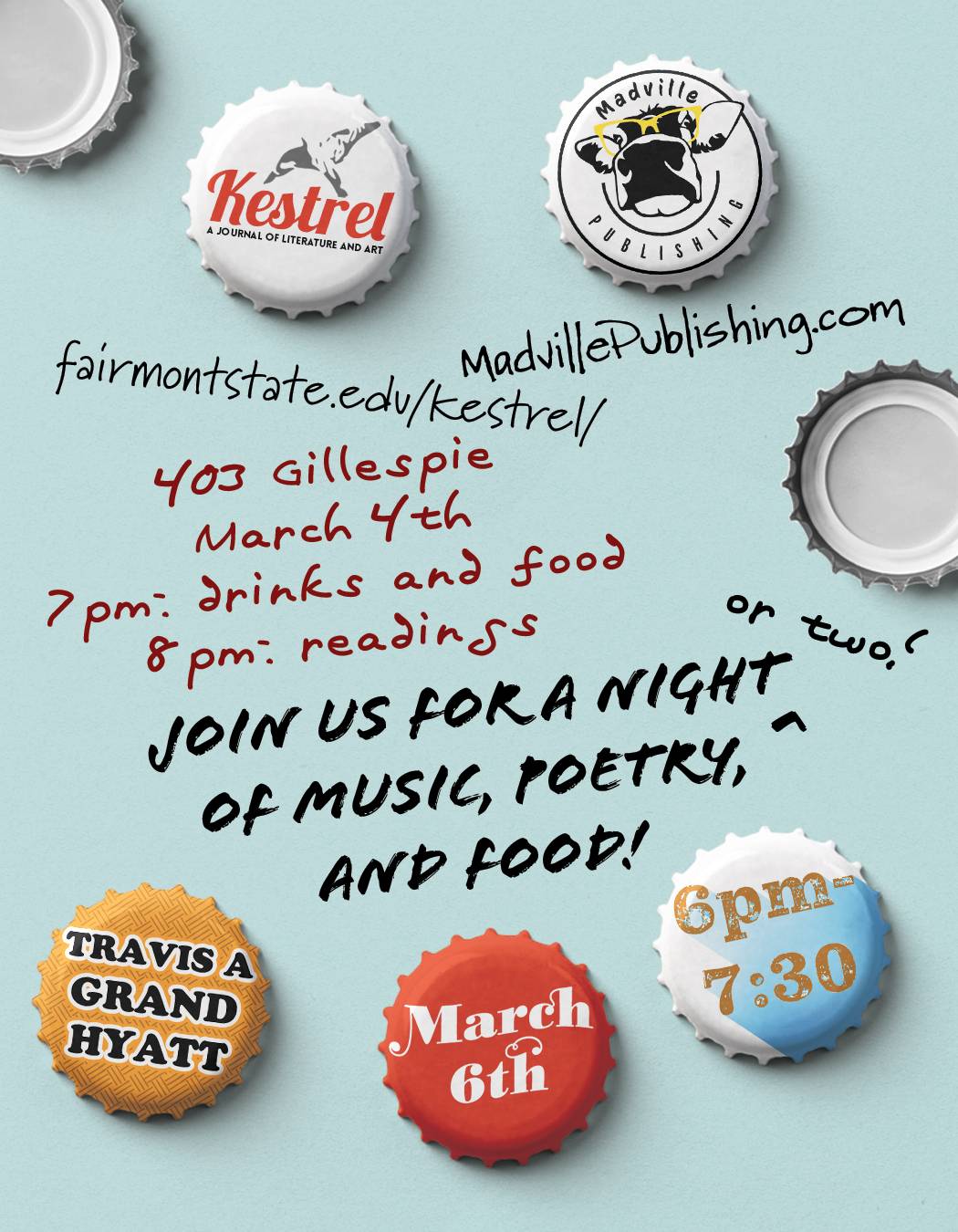
Where can you find Madville Publishing at #AWP20?
We’ll be in the Bookfair in San Antonio this year, at booth number 1658 alongside our friends at Kestrel Journal of Literature and Art.

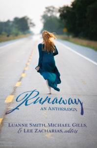
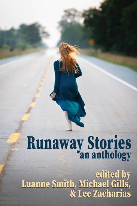
 The Runaway Anthology results are in at long, long, last. We had hoped to make this announcement three weeks ago. However, the universe conspired to slow us down with dreadful things like illness, injury, surgery and several deaths in our families, but we are gathering our wits at last. We are ready to announce the stories our judges have chosen to include in our 2020 short fiction anthology, Runaway Stories: An Anthology [working title]. *

 Sales from the anthology at both readings amounted to $250.00, all of which was donated to Casa Juan Diego, a House of Hospitality in Houston which provides food, clothing, and shelter—both long-term and short term—to immigrants and the homeless. They accept donations of food, clothing and other items on their premises on Rose Street and online through their website.