Posted on

Under the Cover—Mistakes by the Lake

Mistakes by the Lake cover

Book covers are amazing things. They can lure readers in, jolt their imaginations, prod them to, perhaps, pick up a book and read it. And during the reading of a book, its cover can be revisited, prompt additional exploration as to what the cover means vis a vis the contents, the characters, the story.

So, I’m not sure Bo Diddley (and Kelly Bell) are right (although their music sure isn’t wrong): https://www.youtube.com/watch?v=PnWvPZXLDUU

While any best-of lists will inherently miss some great book covers, when I reflect on covers that stuck with me, these are a few that come to mind:

The Great Gatsby: The painting by Francis Cugat is haunting and captures so much of the book’s vibe.

Jaws: Yeah, that image says it all.

Your House Is on Fire, Your Children All Gone: The image is arresting and creepy. The extra warning—“YOU TELL ON ME YOU’RE DEAD”—when the book’s held at a certain angle, heightens the creepy.

1Q84: I probably could’ve posted only Chip Kidd covers—he’s that good. I just happen to be reading this particular book now.

The Nickel Boys: Its stark design captures devastating heartbreak and loss.

When I signed with Madville Publishing to publish Mistakes by the Lake, Kim Davis, Madville’s Publisher/Director, sent over her first cover idea:

Initially, I liked it. It has the skyline of Cleveland in the background. And the viewfinder symbolically captures the many and varied views of the city that my stories themselves attempt to capture. I liked how the full image would serve as a nice wraparound cover, too:

We discussed playing with the font; I thought, perhaps, it’d be cool to mimic the font used on the Cleveland script signs (https://clevelandtraveler.com/cleveland-script-signs-guide/) that populate the city. But that didn’t look as cool as I thought it would:

And then I decided I wasn’t in love with it. You know, this might be—I hope not, of course!—but this might be the only book I ever publish. I wanted to love the cover.

One thing I appreciate about Madville is how involved their authors can be. So, with Madville’s blessing1, I went a little nuts.

From April through September 2019, I tried out different ideas. A ton of different ideas. I played with different Cleveland skylines, I played with various Cleveland maps, I played with overhead shots of the city, I played with iconic landmarks, I looked at (and even emailed) a few well-regarded Cleveland artists and photographers (Paul Duda [http://www.pauldudagallery.com/] and Jim Lanza [https://www.foundrywoodprints.com/], both of whom were kind enough to work with me should I find a piece of art I liked). As I stated, a little nuts.

One of the challenges, in my mind: Since my collection spans numerous decades of the city’s history, how could we get a cover to capture that timespan?

Here’s just a smattering of what I did. As you can see, I am in no way a designer, but it was exciting when, later on, I learned how to knock out a picture within the title (see the last two). You’ll also see a few early versions of what, ultimately, became the cover.

Madville patiently waited for me to work through my issues. And, finally, I sent six or so for their review.

They really liked the last one. (I liked that one a lot, too. I love how the old 1796 map explodes into the modern skyline. But, it was mildly problematic: as near as I could tell, the Western Reserve Historical Society owned the rights to that map and I had not yet worked out if we could use it or not. But after some back and forth, WRHS kindly agreed to let us incorporate the map in the cover. Also, it was an old map. The best reproduction of it I could find had elements that were roughed up and lost to wear or folds or both. So, I spent far too many hours digitally touching up and redrawing portions of the map to make it whole.)

Then it was in the capable hands of Jacqui Davis, Madville’s graphic designer: “I take the images and fonts the author likes, then, from the images, I establish a color palette. Ideally, this palette contains no more than six colors … three is better. For Brian’s book, the pinks came from a sunset picture he sent—then there’s the black, beige, and white from the map.”

Jacqui sent this back:

I liked it. A lot. And I loved what Jacqui did with the sky and the words and the overall composition. We thought my name might get lost in the busyness of the map, so that was one element to change. Plus, none of us were sure about the sky. We tried it in blue:

We all agreed the surreal pink was a better choice. (I should note that both sky pieces were photographs I took while living in Costa Rica. To not only have such a big say in my cover’s design, but to also use artwork of mine was all very cool.)

A few more tweaks: Could we see more of the map (so “Cuyahoga” was visible)? How would the map look using a parchment color? Could we try a different font? How would “by the” look in a slightly different and subordinated arrangement? From there, Jacqui made additional tweaks. “I chose this font because the letters are imperfect with a slightly organic feel that matches the lettering on the map and the splotchy ink blot textures of the skyline.”

Yes, I loved it. My publisher loved it. And, nearly a year later, I still love it.

1“Madville handles the cover design process a little differently from most traditional and indie publishers in that we involve our authors in the cover design process. This collaboration happens in different ways. We always ask our authors right up front to give us some idea of what they imagine for the cover. Their responses run the gamut from no idea what they want to some who have the artwork picked out and rights secured to use it. From there, the design process goes back and forth with the author allowed to give their input all the way up to the point where I step in and make the final decision, and I’m never going to pick a design the author doesn’t like!” —Kim Davis, Director, Madville Publishing


Brian Petkash Headshot

Brian Petkash was born and raised in Cleveland, Ohio. He holds an MFA in Creative Writing from University of Tampa and his stories have appeared in Midwestern Gothic and Southword, among other publications. He currently lives in Tampa, Florida, where he remains an avid fan of Cleveland sports.

Posted on

Book Cover Design

No Evil is Wide by Randall Watson Cover

Don’t judge a book by its cover, they say

…but we all do it anyway.

Because of this, designing a book cover can be one of the most crucial and time consuming aspects of publishing a book (apart from actually writing the book, of course). The cover must be right.

When a book’s cover is wrong, can give a potential reader the wrong impression of what the book is about. This applies if the cover does not match the book’s genre; a shirtless man might draw Fifty Shades fans instead of the high-fantasy audience it was meant for. At the same time, a highbrow cover featuring abstract art might appear too “literary” for the casual reader, who will probably never read the synopsis on the cover to discover that the book is actually a YA adventure novel.

So how do I get the right cover image?

There are many ways to obtain cover art. On the more expensive end of the spectrum, an artist might be commissioned to create original artwork just for the book. It is also possible to license original artwork and photography that already exists, this is generally costly as well. If you are very lucky, you have artist friends who are willing to share their work at little or no charge. As was the case with No Evil is Wide by Randall Watson. In fact, Watson was spoiled for choice as he has an extensive personal art collection.

No Evil is Wide

Released in November of 2018, Watson’s novel is both dark and chaotic and we wanted to make sure that the cover reflected that. Watson wanted to use a piece from his personal art collection for the cover of No Evil is Wide, and there were some excellent paintings to choose from, but we ran into a snag. We didn’t have permission to use them.

Ownership of a piece of art, doesn’t mean one owns the right to reproduce that piece of art.

Ownership of a piece of art, doesn’t mean one owns the right to reproduce that piece of art. Physical ownership does not equal intellectual ownership. The author or publisher must have written permission from the artist to use their work, or a licensing agreement.

Luckily for us, Watson was able to track down one of his favorite artists despite the fact that they were out of touch for a decade. Once we received Charles Moody’s permission, we were able to create a selection of composite covers, each with a different painting of Moody’s. (see below)

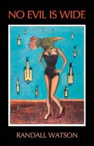
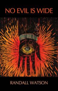
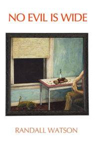
Right off the bat, the third cover was simply too bright and did not match the overall theme of the novel, but we weren’t ready to give up on it, so we changed the background and typography colors, which improved it a lot, but the painting still didn’t convey a strong enough message. Similarly, the first image of the bird-headed girl, while powerful, didn’t have the violent appeal of the hand image. The bright reds in that painting screamed for our attention. We could see ourselves  picking up that bright red book at Barnes and Noble. Still, the author, Randall Watson, wasn’t sold on it, so we tried some variations.

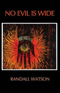
There was still something about the red background and and the framed image that wasn’t right. The text and the image felt disconnected. Our resident millennial didn’t like how… “old” it felt—like a text book.

We had just read this Literary Hub article discussing the current fashion in covers that focuses on bold text using all-caps. We got mixed replies when we shared that article on Facebook, but I loved the bold type because it is easy to read, even on a tiny thumbnail of the cover. In addition, the font feels as though it’s a part of the image itself, not just slapped on top of a picture.

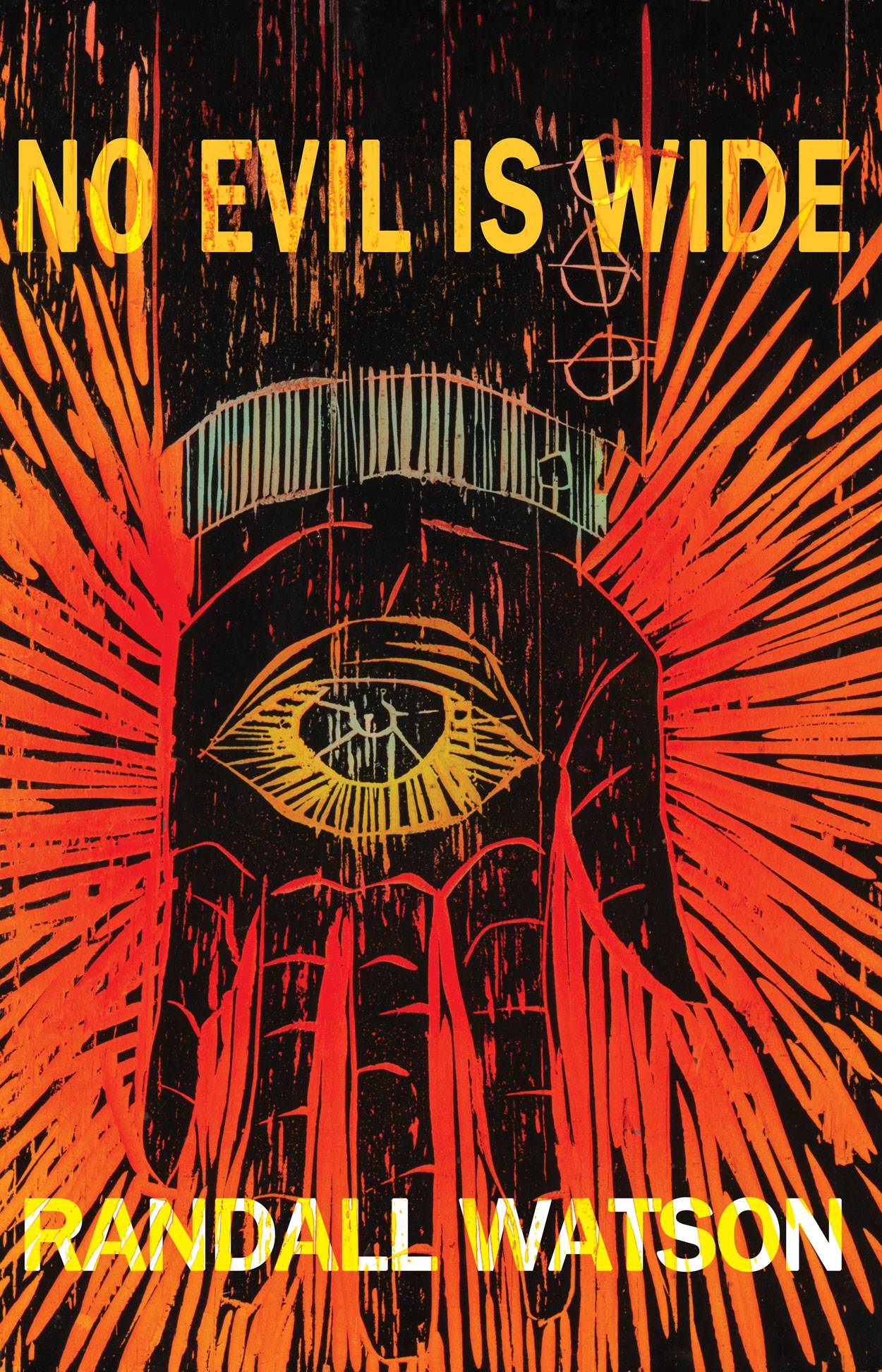
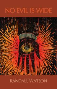
With that in mind, after playing around with fonts, colors, and layer blending modes in Photoshop, we came to our final rendition of the No Evil is Wide cover:

This cover immediately catches the eye–peaks the reader’s curiosity and makes them ask the important questions.

What’s up with that dude’s hand? It looks like he’s not having a very good time. Is that fire? Why is there an eye there? No Evil is Wide? What does that mean?

All fantastic questions that inevitably end with the most important thing you want a potential reader to think:

I’m gonna read the synopsis.