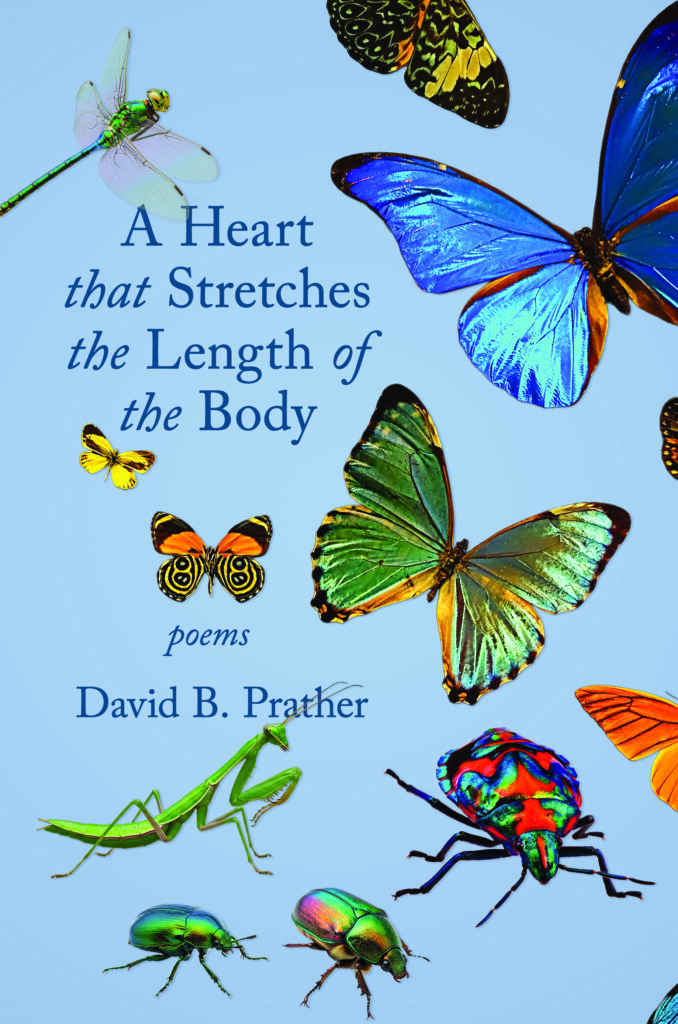
Here is a sneak peak at the front covers for the 2025 Arthur Smith Poetry Prize first prize winner and runner up. They’ll be coming out in spring 2027, and as always, our judges did an amazing job selecting the winners!
2025 Arthur Smith Poetry Prize winner, A Heart that Stretches the Length of the Body, by David B. Prather.My Out-Migrations: Poems by Elaine Fowler Palencia is the first runner up in the 2025 Arthur Smith Poetry Prize competition.
Follow the link below if you want a refresher about the history of the Arthur Smith Poetry Prize. All the past winners and judges are listed there.
So many people have been patiently waiting for news of the selection progress with Sticks & Bricks. At last, the editors, have given us the go-ahead to share a longlist with everyone, with heartfelt apologies because family emergencies intruded, and kept the selection process on hold for too long. We won’t be able to fit all of these into the book, but at least submitters can check this list to see if their submission is still under consideration.
The Longlist (and a name change)
Submitted work for THE WRONG SIDE OF THE TRACKS: STORIES
Hallmark Town—Linda Heuring
A Day In the Life of a Five Year Old Pool Player—Francine Roderiguez
Paquete—Dan Timoskevich
Backyards—Catherine Alexander
All the Lonely People—Alex Stein (lyrics issue)
King of the Lake—Christine Rice
Dogs Always Bark—Melissa Chordas
A White Girl, A Horse, Two Cats and a Dog—Deborah Meltvedt
The Lesser Countries—August Tarrier
Witnesses—April Asbury
Human Statues—Leslie Johnson
Settle—Troy Bernardo
Diorama—Steve Tem
Street Sermon Annie—Vali Hawkins-Mitchell
Gonna Like It in the Jailhouse—Polar Levine
Whatever Happened to the American Dream—Don Robishaw
By the Grace—Gayle Bell (flash fiction)
Jets—R. Louis Fox
Gina and the Werewolf—Hadley Moore
Federico and His Boy—Victoria Ballesteros
Canary—Virginia Pina (pen name Watts)
Private Duties—Madeleine Mysko
The Angel of Lead Belly’s—John Mauk
Solicited Work for THE WRONG SIDE OF THE TRACKS: STORIES
Hunger—Pirette McKamey
Fast Hands, Fast Feet—Maurice Carlos Ruffin
Afterglow—Steph Post
Some Get-Back—Eric Miles Williamson
Leaving Early—Penn Stewart
Grit—Jesse Waters
Hard Shoes—Steve Gutierrez
The Short Story—Steve Gutierrez
Palette—Chavisa Woods
Kitty Rose—Jana Sasser (J.C. Sasser)
Flowchart—Kim Addonizio
Christmas Story of the Golden Cockroach—Ana Castillo
Take our poll to tell us which cover you like best. It doesn’t mean we’ll change our minds about the one WE like, but it’s always fun to see what everyone thinks!
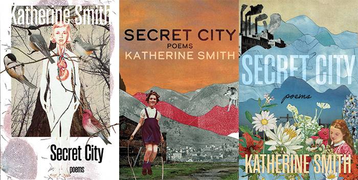
While Katherine Smith writes beautiful poetry, Kathryn also creates collages we can’t stop looking at.
The story begins with the Madville crew doing some online research about a new poet we had just signed, Katherine Smith. (Secret City, Madville, August 2022). Expect a preorder page to become available for this collection in May. You’ll find that on our homepage, https://madvillepublishing.com.
But back to the reason for the search in the first place, we were looking for inspiration for Katherine Smith’s book cover. We like to start by looking at an author’s previous covers, so we started by looking at Katherine’s Woman Alone on the Mountain (Iris Press, 2014). After that, our eyes were naturally drawn to the really striking collage art of Katheryn Smith, who turned up among our search results. We contacted her about her art before even realizing she is also a poet. Learn more about her at kathrynsmithpoetry.com
Shortly after my short story collection Judgment Day & Other White Lies was picked up by Madville Publishing, I read “Under the Cover – Mistakes by the Lake” on Madville’s blog where author Brian Petkash describes his process of coming to the stunning book cover design for his debut short story collection Mistakes by the Lake, a collection that is coincidentally my favorite book I’ve read from the Madville catalog. Since my own short story collection is, like Petkash’s, a linked collection with several shared themes, I reached out to Kim Davis, press director for Madville, and asked if it would be possible to have a local artist and graphic designer I knew design the cover for me.
Kim informed me, in fact, that it is the intention of Madville to offer author’s more creative control in the publication process, that she believes collaboration makes for better titles. Especially on an element like the cover design, she thinks writers can offer much help in selecting pointed images that direct readers’ eyes to books they will enjoy reading.
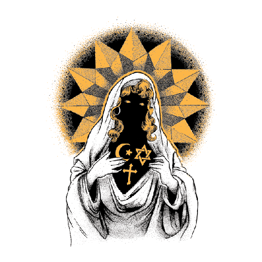
In my own case, I knew right away I wanted to ask Crowcrumbs to design the cover. She is an old friend of mine and local artist in Houston, TX who studied design at the University of Houston and does compelling illustrations and graphic design. I also have always sensed a lot of similarity between her work and my own in terms of its thematic nature. In particular, two images spoke to me and told me she would be the best person to ask.
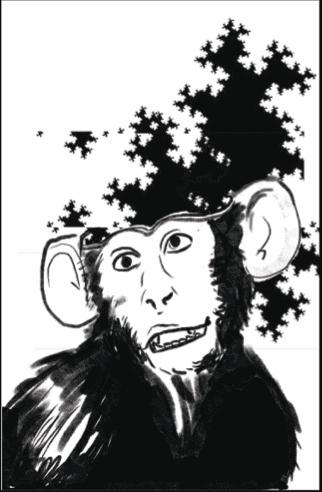
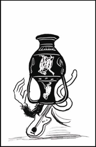
by crowcrumbs
by crowcrumbs
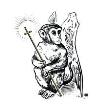
You see, my collection is centered around retellings of Greco-Roman and Christian myths that challenge foundational truths in American society like patriarchy, capitalism, and in particular, white supremacy. The above images jumped off the page to me as ones that were both blasphemous and reverent at the same time, images that could reflect my own technique of using meta-narratives that both reify and problematize traditional culture. Additionally, two of the more prominent stories in the collection in terms of their imagery are the opening alternative telling of Genesis “Para(Fa)ble of the Stoned Ape,” where violent sex-crazed stoned monkeys create western civilization by hallucinating and then telling stories of their hallucinations, and also, “‘Per-C and ‘Dusa: A Narrative Representation of a Graphic Epic’ by Angela Ames, PhD,” which is an ekphrastic retelling of the Perseus and Medusa myth in the form of a fake scholarly article. Therefore, the monkey and the mysterious woman adorned in religious imagery felt like they could be synthesized in some form that would make for a great cover to Judgment Day & Other White Lies.
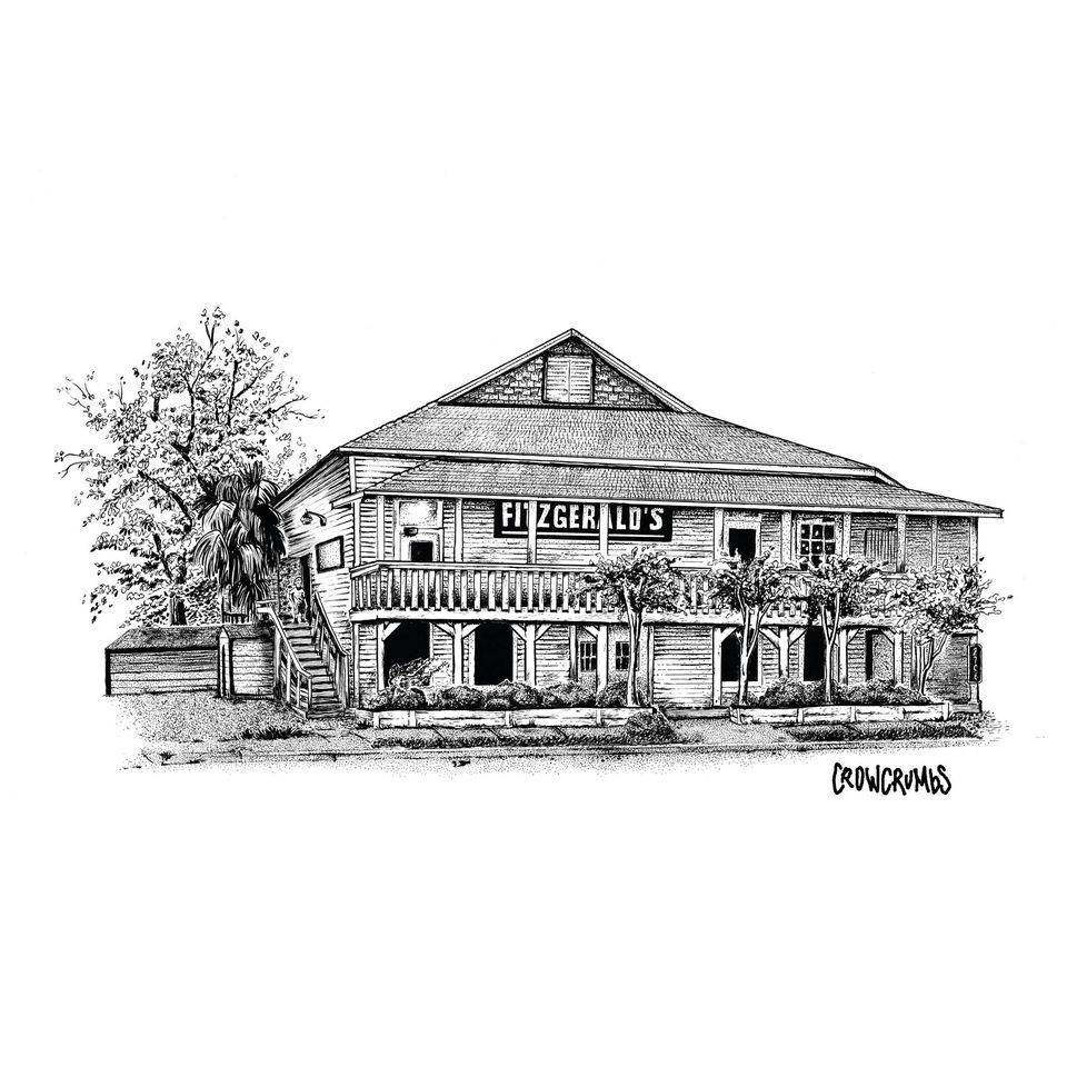
Not to mention, most of the collection takes place in Houston, TX, where Crowcrumbs and I both live. In fact, one of Crowcrumbs’ most sought after images is her sketch of the famous rock music club Fitzgerald’s (RIP) which was once home to many of our favorite local punk bands over the years (buy a print of the below image here!). I figured between the ominous religious imagery, the evolutionary and creationist themes, and her photorealistic interpretations of local landmarks that we would surely find a cover design that was perfect for the book (and I believe the one we eventually came to is, in fact, perfect).
One of Crowcrumbs’ most sought after images is her sketch of the famous rock music club Fitzgerald’s (RIP) which was once home to many of our favorite local punk bands over the years (buy a print of the below image here!)
Setting out with a few images I picked out of Crowcrumbs’ catalog to give her direction on what kind of design I would like, we discussed the possibility of synthesizing local haunts, religious imagery, and also some imagery from the stories themselves. We also discussed doing a black-and-white color scheme that would align with the discussions on racial identity that are interspersed throughout the collection. Crowcrumbs went to work sketching some rough images that we might use on the cover.
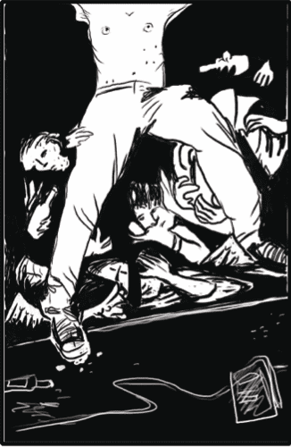
First, we talked about using an image from the story “Fury, Or a Matricide in Sound,” which is a retelling of the Oresteia that involves the heavy metal musician Orestes helping his mother commit suicide to escape from her questionably terminal illness. The image at left comes from later in the night after he has left his mother to die when he stands in judgment of the crowd, who we discussed having a religious component, perhaps like a group of monks. Here, one of those members is stage diving into the waiting arms of that judgment.
We also discussed just doing a direct image from the “Per-C and ‘Dusa” story, one where Per-C paints the decapitated Gorgon head in the sky above the First City Tower in Houston, TX in a graffiti type style.
Then, there was the fractal monkey mind explosion, which again, references “Para(Fa)ble of the Stoned Ape” and also introduces one of the recurrent themes in the collection, the idea that narrative is a fractal process grown out of control where we establish the parameters and influence of time and space on our own psyches by simultaneously imagining ourselves in the contexts of the characters we love and hate in stories, the genres those stories belong to, the tradition those genres emerge from, and the place of those traditions within the process of narrative altogether, finding meaning by noticing self-affine structures that contain symmetry across scales.
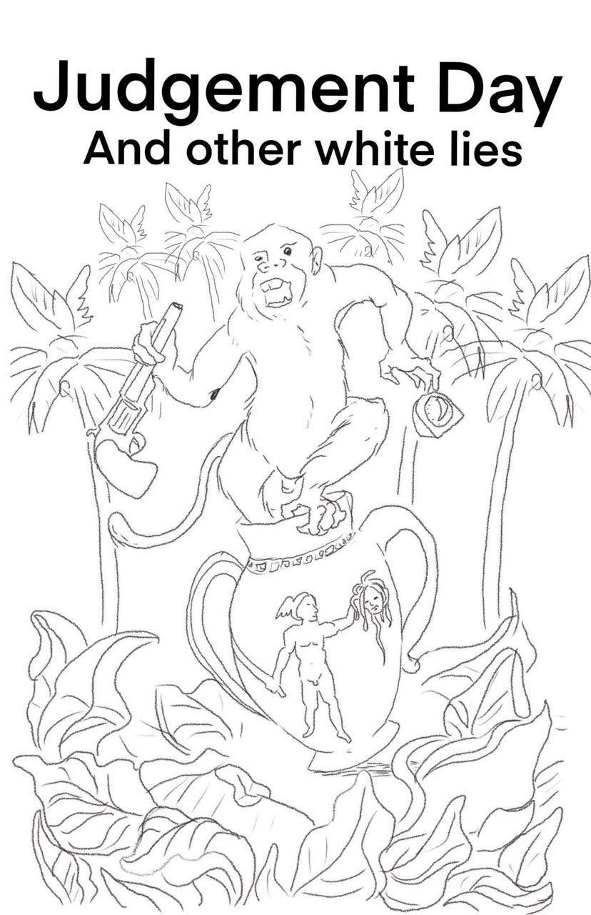
Finally, we discussed a Greek style ancient vase with elements from each story spilling out of it, showing the neoclassical mode of critique this collection looks to subvert.
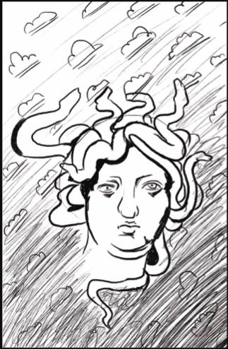
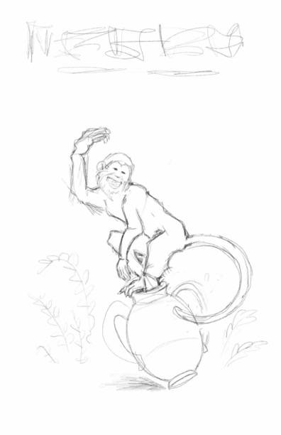
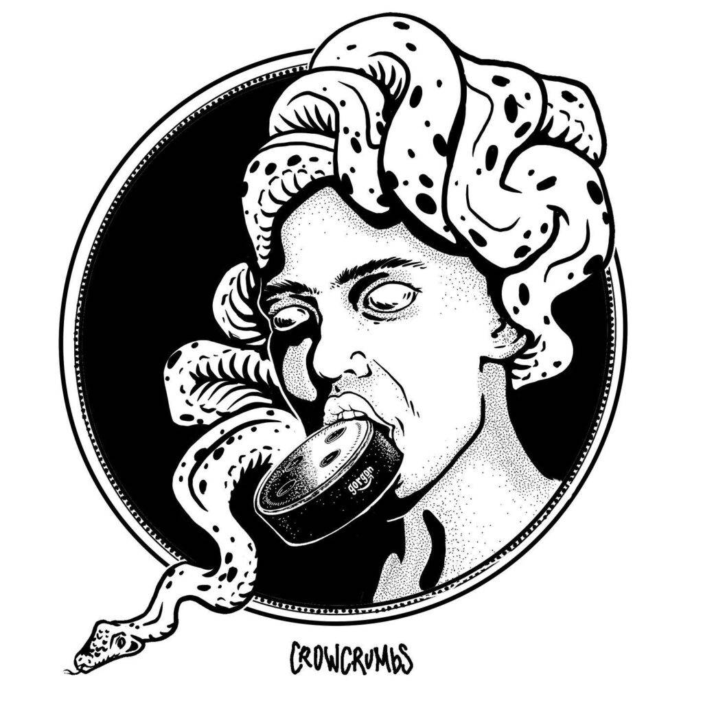
While Crowcrumbs’ initial sketches all had elements that I wanted on the cover, none of them had fully struck me as encompassing the thematic quality of the full-breadth of the collection. So, we discussed perhaps synthesizing some of those cover designs and having a monkey come out of a vase that maybe had a medusa head in the artwork. She sent me back one more initial sketch of that idea. She also explained to me that drafting is her first and true love as an artist. She also uses this skill most frequently, since she has been the primary illustrator for George Covington’s biweekly opinion column in the Big Bend Sentinel, a paper covering the region of West Texas where Crowcrumbs used to live and work as a librarian. Her illustrations in the Big Bend Sentinel include similar aesthetics to mine too, like this illustration of a Gorgon head she did for a Covington column about the nefarious nature of Amazon’s Alexa.
She also told me she liked the process because while “it relates to the text, it is also not necessarily true to life, something that makes it both an interpretation and its own creation, and I get to use my other skills at my day job too where I focus on user experience of software design. It forces me to consider the audience and what they will imagine as they read the words and process my artwork.”
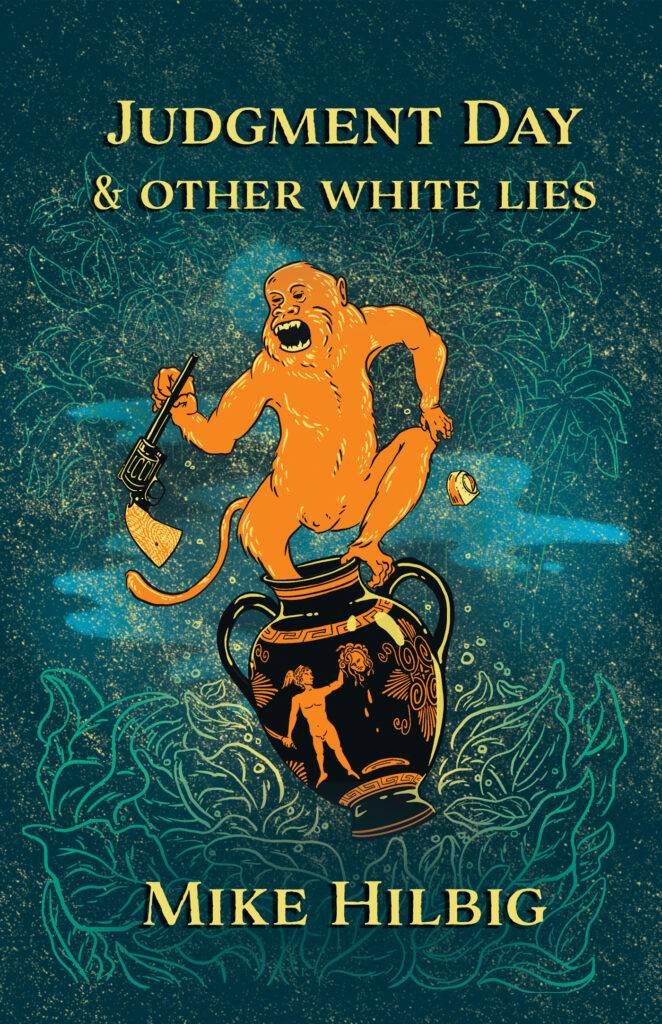
The British spelling of the title aside, this was the sketch that finally spoke to me. I gave her the okay to precede bringing that image to completion for the cover design, which ended up being far more detailed and elaborate. Later, when asking Crowcrumbs about her process, she explained to me, “I start on paper, since it is more gestural, it gives me space to play around and is less committal. It can get messy, basically. Then, once I find an image I like, I take a photo and drop it into ProCreate, which is the poor man’s Photoshop. I use the stylus feature there to redraw the image, I add color and definition. Finally, I transfer it to Photoshop, which I use a limited version of to add the finishing touches, since it allows more layering of the design features than does ProCreate.”Crowcrumbs emphasized that she used a similar, albeit more lengthy process, for coming to a book cover design for Judgment Day & Other White Lies. She read a manuscript copy of the book I sent her and really tried to process not just what images came from the book itself but how those images might be combined in a way so as to evoke a similar theme. This was why, in the end, that even though I asked for a mostly black-and-white cover with perhaps a little color around the edges that she decided for a full-color cover design. “I just didn’t think the black-and-white version,” Crowcrumbs explained, “or the later version I made, where the monkey was a traditional brown, were fully hitting on the surrealism I encountered in the book. Your stories pop off the page by flaunting expectations, and I wanted a color scheme that did the same. This was why I went with a traditional orange for the vase and used it on the monkey too while using the more surreal greens and blues and starry sky elements in the background.”
I was thrilled with it when she sent me the initial proof and believed this was where she really came through in taking ownership of the image, as I told her she had free rein to do, since she was the artist and I was the writer. I trusted her skill and trusted her as a person, us being friends for years and all (and in the same online book club together to protect our sanity during the pandemic).
I just love how the image is both threatening and playful, evocative in the color scheme, and how with the presence of Greek history, a revolver, an egg timer, and a wild monkey, that it creates a true sense of urgency, along with mystery, something that I hope this collection does in terms of engaging white people in their own interest in dismantling white supremacy.
So that’s the story of how the book cover came into being. If you like the cover design, please consider commissioning Crowcrumbs for your own artistic needs. Again, this cover perfectly captures my literary aesthetic in a visual form. Also, you can purchase copies of her prints, as well as t-shirts and stickers with her artwork on it here. Lastly, for those of you local to Texas, be on the lookout for combined readings and art show collabs between Crowcrumbs and me to promote the book release, and to promote Crowcrumbs as the incredible artist and designer that she is.