Posted on

Under the Cover—Mistakes by the Lake

Mistakes by the Lake cover

Book covers are amazing things. They can lure readers in, jolt their imaginations, prod them to, perhaps, pick up a book and read it. And during the reading of a book, its cover can be revisited, prompt additional exploration as to what the cover means vis a vis the contents, the characters, the story.

So, I’m not sure Bo Diddley (and Kelly Bell) are right (although their music sure isn’t wrong): https://www.youtube.com/watch?v=PnWvPZXLDUU

While any best-of lists will inherently miss some great book covers, when I reflect on covers that stuck with me, these are a few that come to mind:

The Great Gatsby: The painting by Francis Cugat is haunting and captures so much of the book’s vibe.

Jaws: Yeah, that image says it all.

Your House Is on Fire, Your Children All Gone: The image is arresting and creepy. The extra warning—“YOU TELL ON ME YOU’RE DEAD”—when the book’s held at a certain angle, heightens the creepy.

1Q84: I probably could’ve posted only Chip Kidd covers—he’s that good. I just happen to be reading this particular book now.

The Nickel Boys: Its stark design captures devastating heartbreak and loss.

When I signed with Madville Publishing to publish Mistakes by the Lake, Kim Davis, Madville’s Publisher/Director, sent over her first cover idea:

Initially, I liked it. It has the skyline of Cleveland in the background. And the viewfinder symbolically captures the many and varied views of the city that my stories themselves attempt to capture. I liked how the full image would serve as a nice wraparound cover, too:

We discussed playing with the font; I thought, perhaps, it’d be cool to mimic the font used on the Cleveland script signs (https://clevelandtraveler.com/cleveland-script-signs-guide/) that populate the city. But that didn’t look as cool as I thought it would:

And then I decided I wasn’t in love with it. You know, this might be—I hope not, of course!—but this might be the only book I ever publish. I wanted to love the cover.

One thing I appreciate about Madville is how involved their authors can be. So, with Madville’s blessing1, I went a little nuts.

From April through September 2019, I tried out different ideas. A ton of different ideas. I played with different Cleveland skylines, I played with various Cleveland maps, I played with overhead shots of the city, I played with iconic landmarks, I looked at (and even emailed) a few well-regarded Cleveland artists and photographers (Paul Duda [http://www.pauldudagallery.com/] and Jim Lanza [https://www.foundrywoodprints.com/], both of whom were kind enough to work with me should I find a piece of art I liked). As I stated, a little nuts.

One of the challenges, in my mind: Since my collection spans numerous decades of the city’s history, how could we get a cover to capture that timespan?

Here’s just a smattering of what I did. As you can see, I am in no way a designer, but it was exciting when, later on, I learned how to knock out a picture within the title (see the last two). You’ll also see a few early versions of what, ultimately, became the cover.

Madville patiently waited for me to work through my issues. And, finally, I sent six or so for their review.

They really liked the last one. (I liked that one a lot, too. I love how the old 1796 map explodes into the modern skyline. But, it was mildly problematic: as near as I could tell, the Western Reserve Historical Society owned the rights to that map and I had not yet worked out if we could use it or not. But after some back and forth, WRHS kindly agreed to let us incorporate the map in the cover. Also, it was an old map. The best reproduction of it I could find had elements that were roughed up and lost to wear or folds or both. So, I spent far too many hours digitally touching up and redrawing portions of the map to make it whole.)

Then it was in the capable hands of Jacqui Davis, Madville’s graphic designer: “I take the images and fonts the author likes, then, from the images, I establish a color palette. Ideally, this palette contains no more than six colors … three is better. For Brian’s book, the pinks came from a sunset picture he sent—then there’s the black, beige, and white from the map.”

Jacqui sent this back:

I liked it. A lot. And I loved what Jacqui did with the sky and the words and the overall composition. We thought my name might get lost in the busyness of the map, so that was one element to change. Plus, none of us were sure about the sky. We tried it in blue:

We all agreed the surreal pink was a better choice. (I should note that both sky pieces were photographs I took while living in Costa Rica. To not only have such a big say in my cover’s design, but to also use artwork of mine was all very cool.)

A few more tweaks: Could we see more of the map (so “Cuyahoga” was visible)? How would the map look using a parchment color? Could we try a different font? How would “by the” look in a slightly different and subordinated arrangement? From there, Jacqui made additional tweaks. “I chose this font because the letters are imperfect with a slightly organic feel that matches the lettering on the map and the splotchy ink blot textures of the skyline.”

Yes, I loved it. My publisher loved it. And, nearly a year later, I still love it.

1“Madville handles the cover design process a little differently from most traditional and indie publishers in that we involve our authors in the cover design process. This collaboration happens in different ways. We always ask our authors right up front to give us some idea of what they imagine for the cover. Their responses run the gamut from no idea what they want to some who have the artwork picked out and rights secured to use it. From there, the design process goes back and forth with the author allowed to give their input all the way up to the point where I step in and make the final decision, and I’m never going to pick a design the author doesn’t like!” —Kim Davis, Director, Madville Publishing


Brian Petkash Headshot

Brian Petkash was born and raised in Cleveland, Ohio. He holds an MFA in Creative Writing from University of Tampa and his stories have appeared in Midwestern Gothic and Southword, among other publications. He currently lives in Tampa, Florida, where he remains an avid fan of Cleveland sports.

Posted on

By the Light of a Neon Moon

By the Light of a Neon Moon, edited by Janet Lowery

By the Light of a Neon Moon, edited by Janet LoweryOur first poetry anthology is at the printer!

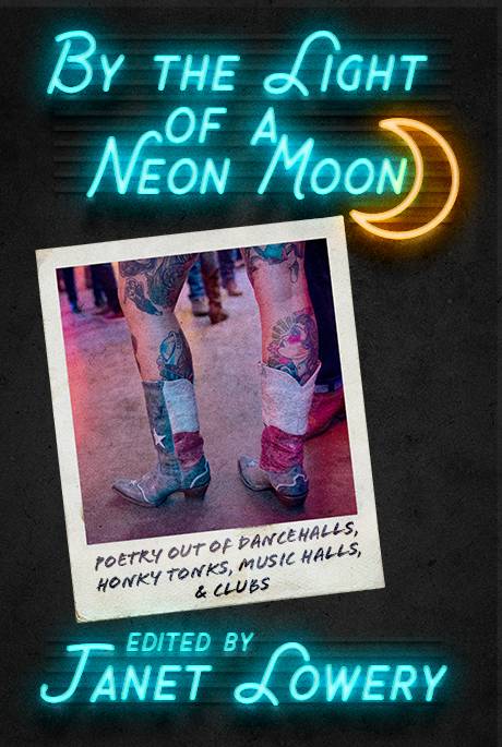
If you’ve been following us for a while, you will have seen our calls for submissions to the Dancehall Poetry Anthology. We are happy to announce that it has gone to press, and we hope to have copies available at AWP! Editor Janet Lowery named the collection By the Light of a Neon Moon and Jacqui Davis created this eye-catching cover for it. We are humbled by the quality of the poetry we received, and we cannot wait to share it with everyone. The contributors are already discussing the fact that the launch party should include a dance. We aren’t sure how we’ll pull that off, but we love the idea!

[ms_button style=”normal” link=”http://www.seattlebookcompany.com/by-the-light-of-the-neon-moon/?ctk=81ff9a07-267a-4ce7-8768-bc17894a342d” size=”medium” shape=”” shadow=”no” block=”no” target=”_blank” gradient=”yes” color=”#1fb9c4″ text_color=”#ffffff” icon=”” icon_animation_type=”” border_width=”0″ class=”” id=””]Preorder Now[/ms_button]

A sneak-peek at the Table of Contents:

We had several poets laureate contribute to the collection as well as many other award-winning poets from around the country. Have a look at the Table of Contents.

Contents

Introduction by Janet Lowery

I—Neon Light

Beloved, After These Things by Alan Birkelbach
Like People in Love by Kimberly Parish Davis
A Thing About Rhumba by Gianna Russo
Pretty Woman by Luanne Smith
Not That Sally by George Drew
Dear Will’s Pub by Pj Metz
Rose-Colored by Janet Lowery
Old Flame by Winston Derden
Music for Arms Like Ours by Mike Schneider
Oh, That Buckskin by Christine Cock
Dancing Fool by John Grey
Always Open by Karen Head
Words from My Father by karla k. morton
One Way Traffic by Alan Birkelbach
Dancing at Dirty Frank’s by Lisa Naomi Konigsberg

II—Neon Signs

The Bull Rider by Katherine Hoerth
The Archaeologist Dreams of Sleep by Kimberly Parish Davis
Chevy Pick-Up, Loaded by Ed Ruzicka
Integration 1964 by Dave Parsons
Dalliance by Ruth I. Healy
Triple-Two at the Dance by Janet Lowery
Prickly Pear by Katherine Hoerth
Partner by Sarah Cortez
You Ain’t the First Singed Hash Browns on My Plate by R. Gerry Fabian
Just Believe Her! by Alan Birkelbach
Rodeo Exchange by karla k. morton
Back by Juleigh Howard-Hobson
I May Not Be Drunk, But I’ll Get There by Herman Sutter
Your Dancing Lessons Didn’t Pay Off by J. J. Steinfeld
Little Heretic by Gerry LaFemina
Waiting for Resurrection by Leah Mueller
Always by Anusha VR
The Way We Danced Before I Became Another Ex in Texas by Laurie Kolp
Dancing with a Cue Stick by George Drew
Death at the Dancehall by Janet Lowery
Two Dogs Howling at the Moon by Dave Parsons
Resurrection Mary by Carolyn Kreiter-Foronda

III—Neon Hearts

Standing on the Edge of the Roadhouse Charybdis by Alan Birkelbach
Dancing Before by Lesley Clinton
Zydeco Shindig by Dolores Comeaux
Friday’s Dance by Mike Schneider
Road House on the Way to Cheyenne by Rick Campbell
Guitar and Mandolin by Gerry LaFemina
Dress Code at the Dance Hall by Alan Birkelbach
Here at Ransom’s Saloon by George Drew
Hard Wood by Jerry Bradley
Bootstrap by Winston Derden
6 a.m. Outside the Dance Hall by John Grey
Empties by Gerry LaFemina