Posted on

Under the Cover—Mistakes by the Lake

Mistakes by the Lake cover

Book covers are amazing things. They can lure readers in, jolt their imaginations, prod them to, perhaps, pick up a book and read it. And during the reading of a book, its cover can be revisited, prompt additional exploration as to what the cover means vis a vis the contents, the characters, the story.

So, I’m not sure Bo Diddley (and Kelly Bell) are right (although their music sure isn’t wrong): https://www.youtube.com/watch?v=PnWvPZXLDUU

While any best-of lists will inherently miss some great book covers, when I reflect on covers that stuck with me, these are a few that come to mind:

The Great Gatsby: The painting by Francis Cugat is haunting and captures so much of the book’s vibe.

Jaws: Yeah, that image says it all.

Your House Is on Fire, Your Children All Gone: The image is arresting and creepy. The extra warning—“YOU TELL ON ME YOU’RE DEAD”—when the book’s held at a certain angle, heightens the creepy.

1Q84: I probably could’ve posted only Chip Kidd covers—he’s that good. I just happen to be reading this particular book now.

The Nickel Boys: Its stark design captures devastating heartbreak and loss.

When I signed with Madville Publishing to publish Mistakes by the Lake, Kim Davis, Madville’s Publisher/Director, sent over her first cover idea:

Initially, I liked it. It has the skyline of Cleveland in the background. And the viewfinder symbolically captures the many and varied views of the city that my stories themselves attempt to capture. I liked how the full image would serve as a nice wraparound cover, too:

We discussed playing with the font; I thought, perhaps, it’d be cool to mimic the font used on the Cleveland script signs (https://clevelandtraveler.com/cleveland-script-signs-guide/) that populate the city. But that didn’t look as cool as I thought it would:

And then I decided I wasn’t in love with it. You know, this might be—I hope not, of course!—but this might be the only book I ever publish. I wanted to love the cover.

One thing I appreciate about Madville is how involved their authors can be. So, with Madville’s blessing1, I went a little nuts.

From April through September 2019, I tried out different ideas. A ton of different ideas. I played with different Cleveland skylines, I played with various Cleveland maps, I played with overhead shots of the city, I played with iconic landmarks, I looked at (and even emailed) a few well-regarded Cleveland artists and photographers (Paul Duda [http://www.pauldudagallery.com/] and Jim Lanza [https://www.foundrywoodprints.com/], both of whom were kind enough to work with me should I find a piece of art I liked). As I stated, a little nuts.

One of the challenges, in my mind: Since my collection spans numerous decades of the city’s history, how could we get a cover to capture that timespan?

Here’s just a smattering of what I did. As you can see, I am in no way a designer, but it was exciting when, later on, I learned how to knock out a picture within the title (see the last two). You’ll also see a few early versions of what, ultimately, became the cover.

Madville patiently waited for me to work through my issues. And, finally, I sent six or so for their review.

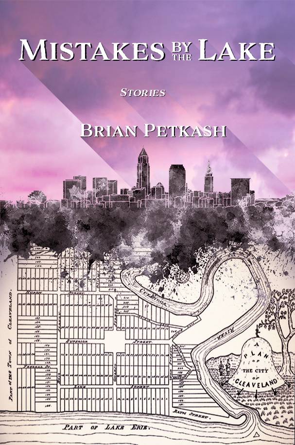
They really liked the last one. (I liked that one a lot, too. I love how the old 1796 map explodes into the modern skyline. But, it was mildly problematic: as near as I could tell, the Western Reserve Historical Society owned the rights to that map and I had not yet worked out if we could use it or not. But after some back and forth, WRHS kindly agreed to let us incorporate the map in the cover. Also, it was an old map. The best reproduction of it I could find had elements that were roughed up and lost to wear or folds or both. So, I spent far too many hours digitally touching up and redrawing portions of the map to make it whole.)

Then it was in the capable hands of Jacqui Davis, Madville’s graphic designer: “I take the images and fonts the author likes, then, from the images, I establish a color palette. Ideally, this palette contains no more than six colors … three is better. For Brian’s book, the pinks came from a sunset picture he sent—then there’s the black, beige, and white from the map.”

Jacqui sent this back:

I liked it. A lot. And I loved what Jacqui did with the sky and the words and the overall composition. We thought my name might get lost in the busyness of the map, so that was one element to change. Plus, none of us were sure about the sky. We tried it in blue:

We all agreed the surreal pink was a better choice. (I should note that both sky pieces were photographs I took while living in Costa Rica. To not only have such a big say in my cover’s design, but to also use artwork of mine was all very cool.)

A few more tweaks: Could we see more of the map (so “Cuyahoga” was visible)? How would the map look using a parchment color? Could we try a different font? How would “by the” look in a slightly different and subordinated arrangement? From there, Jacqui made additional tweaks. “I chose this font because the letters are imperfect with a slightly organic feel that matches the lettering on the map and the splotchy ink blot textures of the skyline.”

Yes, I loved it. My publisher loved it. And, nearly a year later, I still love it.

1“Madville handles the cover design process a little differently from most traditional and indie publishers in that we involve our authors in the cover design process. This collaboration happens in different ways. We always ask our authors right up front to give us some idea of what they imagine for the cover. Their responses run the gamut from no idea what they want to some who have the artwork picked out and rights secured to use it. From there, the design process goes back and forth with the author allowed to give their input all the way up to the point where I step in and make the final decision, and I’m never going to pick a design the author doesn’t like!” —Kim Davis, Director, Madville Publishing


Brian Petkash Headshot

Brian Petkash was born and raised in Cleveland, Ohio. He holds an MFA in Creative Writing from University of Tampa and his stories have appeared in Midwestern Gothic and Southword, among other publications. He currently lives in Tampa, Florida, where he remains an avid fan of Cleveland sports.

Posted on

Puffery: Why Am I Doing This?

Poet George Drew at MVSU

Puffery? you ask. We asked our friend George Drew to give our website visitors some insight into the book promotion process, and being a poet, he responded in poetic fashion…

That many of you might, in the heat of compositional battle, ask, Why am I doing this? I’ve no doubt. And after having won the war and you have your brave new book in hand, what then? How do you get the world to pay attention? Well, you send out emails to all your contacts, you take out advertisements, you get your baby reviewed, you do radio or tv spots, if you’re so lucky, and of course you go forth bravely and do readings, whether you like doing them or not. And in the midst of all that labor, you ask again, and again, Why am I doing this?

Certainly it isn’t for fame and fortune: We all know how fleet of foot those are. Why then indeed? Perhaps the reason is more basic than you generally take time to think. Perhaps it is because…

OF PUFFERY

Once I saw a book entitled Just What the World Needs: Another Freshman English Text, or something to that effect. I easily can imagine someone reacting likewise to this book:

“Oh, dear, another book of literary puffery!” Why, then, risk it? I’m not an essayist of any note—no Lewis Thomas, Loren Eiseley, E.B. White. I know I’m not precisely because I know and love the work of these and others of their pedigree so avidly. They’re full bred; I’m mixed, which has its benefits. Whereas I can’t aspire to their elegance of style and thought, I can to a tenacity that’s mine and owes no allegiance to any but my own gut feeling, genes and mental grasp. Why this book? The work exists, that’s why. It’s mine, and I wish to let you in on it. And that’s as close to noble as I get. The rest is skin and blood and bone: I’m damned tired of first having to locate and then lug around in a bulky black binder all these pieces when I want to read them to an audience, as I sometimes do. A single slim—and I do mean slim—volume is much less strenuous, thank you. It’s really that simple. Still, since it also will exist,

I hope you find some pleasure in this book. If so, that’s good; if not, who knows? There might one day be just what the world needs: a Puffery II.

Drumming Armageddon, poetry by George Drew

Guest Post by George Drew author of Drumming Armageddon

Posted on

Dress Code for AWP20 in San Antonio

AWP20 ad with Madville/Kestrel events

What should you wear to AWP20 in San Antonio this year?

For those who do not know, AWP is the Association of Writers & Writing Programs, and their annual conference is coming up:

#AWP20 Conference and Bookfair

San Antonio, TX
Henry B. González Convention Center
March 4–7, 2020

Key Dates

Materials to View/Download

Social Networking

[I wrote the following observations following #AWP17 in Tampa, though it feels like I started writing them at #AWP16 in Washington DC. I hope my attempt at sarcasm offends everyone equally, but no one gravely!-KD]

I’ve just attended the 2017 Association of Writing Programs (AWP) conference with some 13,000 students and faculty from writing programs and universities around the United States in attendance. I sat among representatives of small presses in the cavernous hall that housed the book market. Everyone was trying to attract students to their writing programs, authors to their submission pages, and buyers to their books. Meanwhile, a profusion of recent MFA and PhD grads schmoozed and congratulated one another comparing notes about the dismal state of the academic job market and reminiscing about grad school. Many had job interviews in hotel rooms scheduled around the trendy off-site readings and parties, though with the advent of the Skype interview, the formerly nerve-wracking AWP interview is not now the right of passage it once was. Still, the young guns found their old friends and discussed who had landed increasingly rare tenure-track jobs and who was still on the market and spending hard-earned adjunct wages to be there. They compared the climates of their respective universities—politically and meteorologically. They drank too much and slept too little, while seasoned faculty members chaperoned grad students—the target consumer group for the massive book fair and the audience for the panel discussions and readings in and around the conference.

I sat behind a crenellated battlement of books I couldn’t even give away and watched people stream past for all three days of the conference. White male Boomer-aged professors wore sports coats and jeans, grey pony tails and earrings the fashion accessories of choice. The African American tenured men favored bright silks and glistening shaved heads. All wore “cool” more comfortably than their female counterparts, who, apart from the tastefully professional African American women, appeared to be either crones or mutton-dressed-as-lamb. Since I fall on that spectrum myself, I feel qualified to comment. The crones gossiped a little too loudly, hair in awkward tufts, mascara smudged, while the mutton-dressed-as-lamb draped chic, risqué clothing over skeletal frames a little too casually, their entourage of graduate assistants shielding them from direct light.

The newly tenured wore uniforms of respectability, tattoos covered. Button-down shirts and sweater vests for the men and blouses over cigarette-skirts for the women with stockings and sensible pumps. The millenials dressed in predictable gender-blended variations, hairstyles their most obvious concession to fashion. Extravagant undercuts and outlandish color declaring their lifestyle choices. Students showed facial-jewelry, body art, and outlandish clothes, while professors favored short buzz-cuts.

And there were poets everywhere. At off-site readings, I listened to angst-ridden verses about sex—childhood abuse, and low self-esteem. Young poets marveled that anyone would have them and ended in despair. Old poets read about their mortality, exploring the seasons through metaphor inevitably resigning themselves to the inevitable. Veterans read in the staccato rhythm of gunfire ending abruptly. Despite the repetitive themes, the abundance of creative writing programs has brought about a renaissance in poetry, but knowing how difficult it is to sell poetry, I expressed my dismay at this situation to Michael Gills—a seasoned fiction writer and professor in jeans and cowboy boots. He set me straight explaining that, in his view, all these programs obviously turned out far more writers than we need, but each of those new writers is also a voracious reader. It’s a kind of writerly-readerly circle jerk.

At the end of the day, when selecting what to pack for AWP20 in San Antonio March 4-8, remember who the audience will be. And remember what you are there for. If you want to sell books, dress like someone who belongs on a university campus. “Business casual” is always safe, but if something more casual is appropriate for your audience, then wear that. Be yourself.

What will the weather be like?

We can guarantee that the weather in San Antonio, Texas, is warmer than where you come from. But it will be early march. You shouldn’t need more than one of the following: a light jacket, blazer, hoodie, or cardigan. Bring light weight clothes you can layer. We predict that we’ll all start shedding layers by lunchtime.

Generally in March, San Antonio maintains an average daily high temperature between 71 and 76 degrees Fahrenheit (21 to 25 degrees Celsius), while the average low temperature ranges between 48 and 54 °F (9 to 12 °C). 56% average humidity. San Antonio tends to get about nine days of rain most years during the month of March. Be sure to have a look at the forcast a few days ahead of your departure for San Antonio.

Where can you find Madville Publishing at #AWP20?

We’ll be in the Bookfair in San Antonio this year, at booth number 1658 alongside our friends at Kestrel Journal of Literature and Art.

A close up of the AWP 2020 book fair map showing Madville's booth #1658 in Sponsors Row


Posted on

Neon Moon Reading Raised $250 for Casa Juan Diego

By the Light of a Neon Moon: Poetry Out of Dance Halls, Honky Tonks, Music Halls and Clubs

Janet Lowery and Meg Spesia smile for the camera under a blue and white sign reading "Casa Juan Diego 4818 Rose Entrada"
Janet Lowery with Meg Spesia, a Catholic Worker from Chicago now working at Casa Juan Diego in Houston.

With support from the English Department at the University of St. Thomas, Houston, on Wednesday Oct 16th in the Art Gallery on campus, poet Janet Lowery hosted a reading of poetry from By the Light of a Neon Moon, the anthology of poems she edited for Madville Publishing. With the help of the Montgomery Arts Council, fiction writer Cliff Hudder, and 2011 Poet Laureate Dave Parsons, a reading from the anthology was also delivered on Thursday October 17 at Lone Star College, Montgomery campus.

By the Light of a Neon Moon: Poetry Out of Dance Halls, Honky Tonks, Music Halls and ClubsSales from the anthology at both readings amounted to $250.00, all of which was donated to Casa Juan Diego, a House of Hospitality in Houston which provides food, clothing, and shelter—both long-term and short term—to immigrants and the homeless. They accept donations of food, clothing and other items on their premises on Rose Street and online through their website.

Poets from the anthology who read at UST with Janet Lowery included Katie Hoerth,  Lesley Clinton, Winston Derden, and Dave Parsons. Poets reading at Lone Star with Dave Parsons and Janet Lowery included Houston poet Winston Derden and poet Karen Head, editor of the Atlantic Review.